Microsoft Teams
Case studyImproving the user experience of the Microsoft Teams for university students.
BACKGROUND
I am a third-year student at OCAD University majoring in Advertising.
In March 2020 my university switched to online learning due to the pandemic.
Did you know? Despite the fact that I am in my third year, I have never attended an in-person class at OCAD.
In March 2020 my university switched to online learning due to the pandemic.
Did you know? Despite the fact that I am in my third year, I have never attended an in-person class at OCAD.

Photo of the Sharp Centre for Design taken shortly after the new building opened in late 2004
So this is a more accurate representation of what my classes look like.

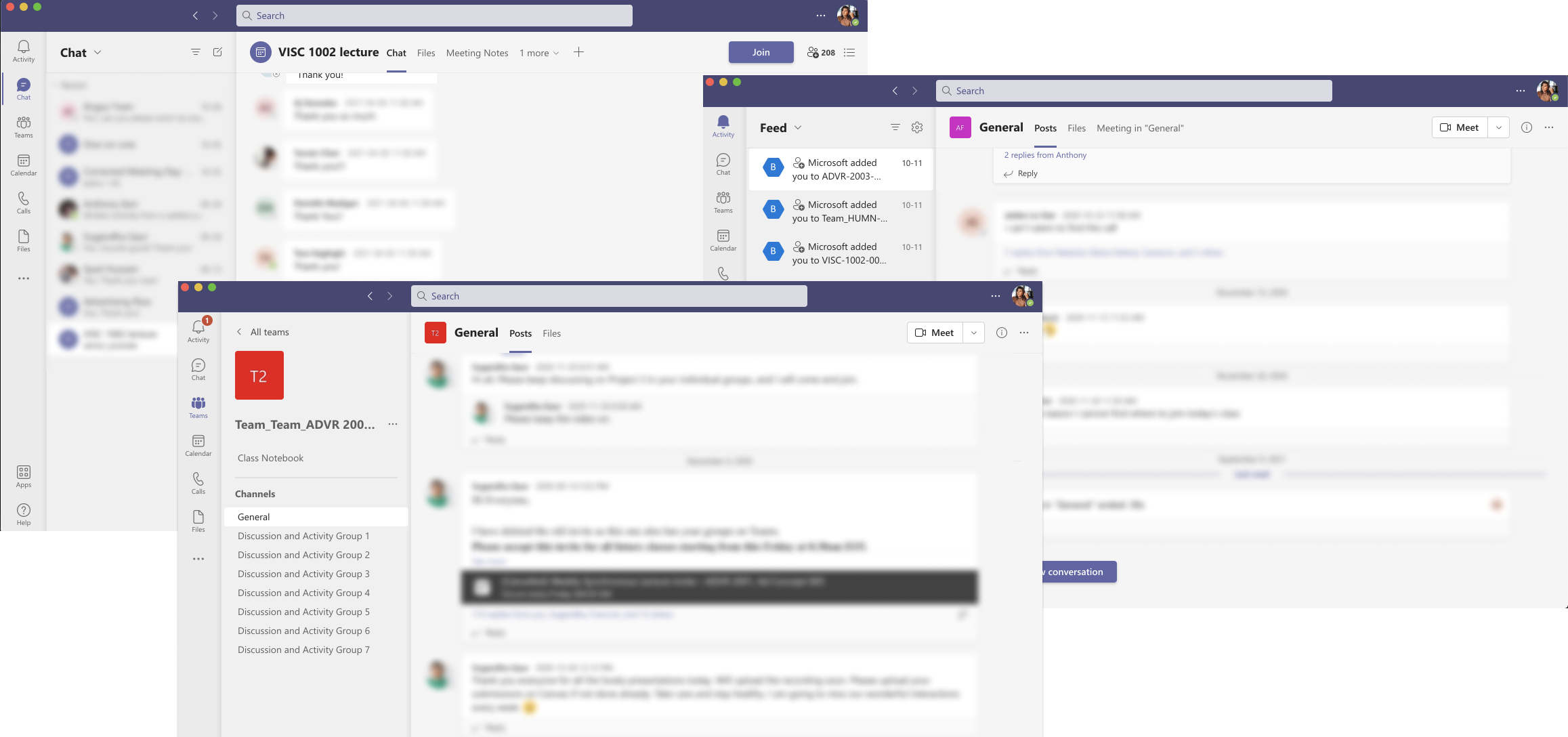
Microsoft Teams windows open on desktop
Because I have so much free time I decided to calculate how much time on average I spent using Microsoft Teams in my previous semester. Here are the results: in my winter semester I spent 504 hours on Microsoft Teams (21 days).
SURVEY
So I started with personal assumptions: confusing labelling and navigation, which lead to Microsoft Teams not being intuitive. The fact that an easy task requires more than three or four steps is frustrating.
So I surveyed 74 university students who are using Microsoft Teams for online learning and here is what they said.
So I surveyed 74 university students who are using Microsoft Teams for online learning and here is what they said.
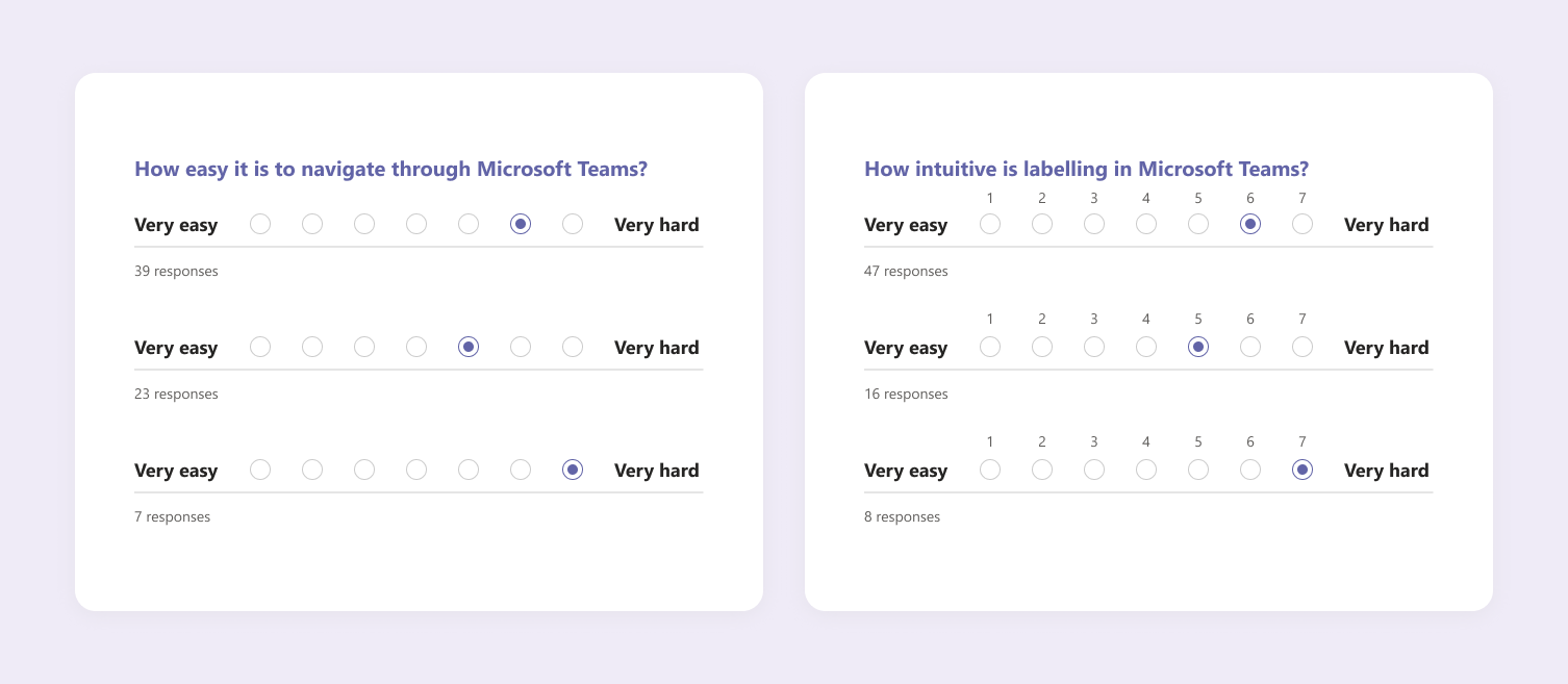
Survey results
HMW
How might we improve online learning experience for students by restructuring the navigation and updating labelling, as well as reworking the IA of Microsoft Teams.
PREVIEW
- Updated labelling with user testing results.
- New improved navigation and simplified lA.
- High-fidelity prototype supported by user testing results.
Online learning made easy
After analyzing the survey results and defining the problem I decided to dig deeper into the problem and set three main goals.GOALS
1. Minimize the steps to achieve a goal within the app.
2. Utilize relevant labelling for common elements.
3. Improve navigation throughout the app.
2. Utilize relevant labelling for common elements.
3. Improve navigation throughout the app.
UNDERSTANDING THE USER
To better understand students experience of using Microsoft Teams for online learning, I conducted four user interviews with students from OCAD university, who use the app on a daily basis.
PRIMARY RESEARCH QUESTION
I was curious to know what exactly makes Microsoft Teams hard to navigate through, as well as learning about how other softwares/university platforms contribute to forming patterns and behaviours.
Proposed explanation: by restructuring the IA and utilizing the relevant labelling I will minimize the steps to achieve certain goals within the app, which will result in greater user experience and make online learning less stressful.
Proposed explanation: by restructuring the IA and utilizing the relevant labelling I will minimize the steps to achieve certain goals within the app, which will result in greater user experience and make online learning less stressful.
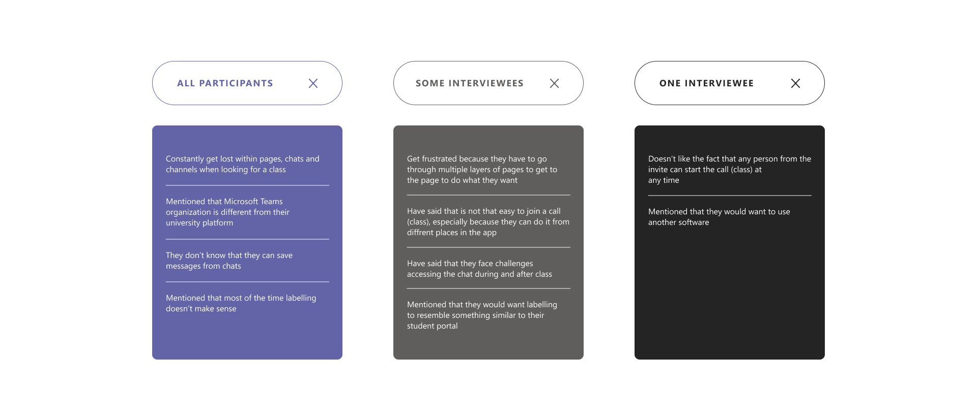
User interviews' findings and summary
Persona
Different from the university portal:
The app doesn't feel like it was built for online learning.
Overwhelming:
There is a lot of different elements nested within each other that make students feel lost.
Where is the class?
Even though there are multiple ways to join the call (class), it only contributes to creating more confusion for students.
Angela is a full-time student, who's main frustration is to have to go through multiple layers of pages to get to the page she wants.
![Persona: Angela]()
![Students' messages from the chat]()
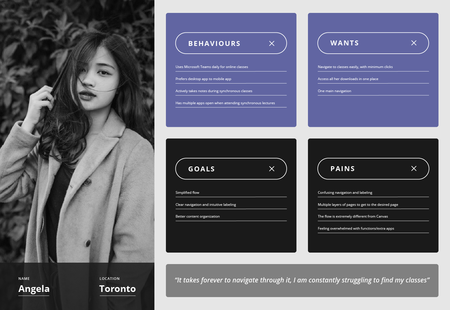
Persona: Angela
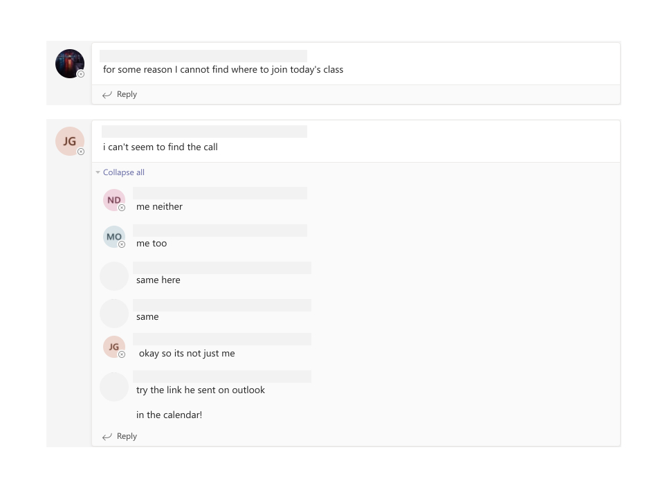
Students' messages from the chat
CARD SORTING 1
The most inconsistent categories:
Teams
Channels
The most inconsistent categories:
Teams
Channels
The biggest usability issue that was discovered above is the lack of clear labelling of the navigation. So I decided to conduct a card sorting workshop with 10 students with original navigation that Microsoft Teams uses to better under original application.
![Card sorting workshop - round 1]()
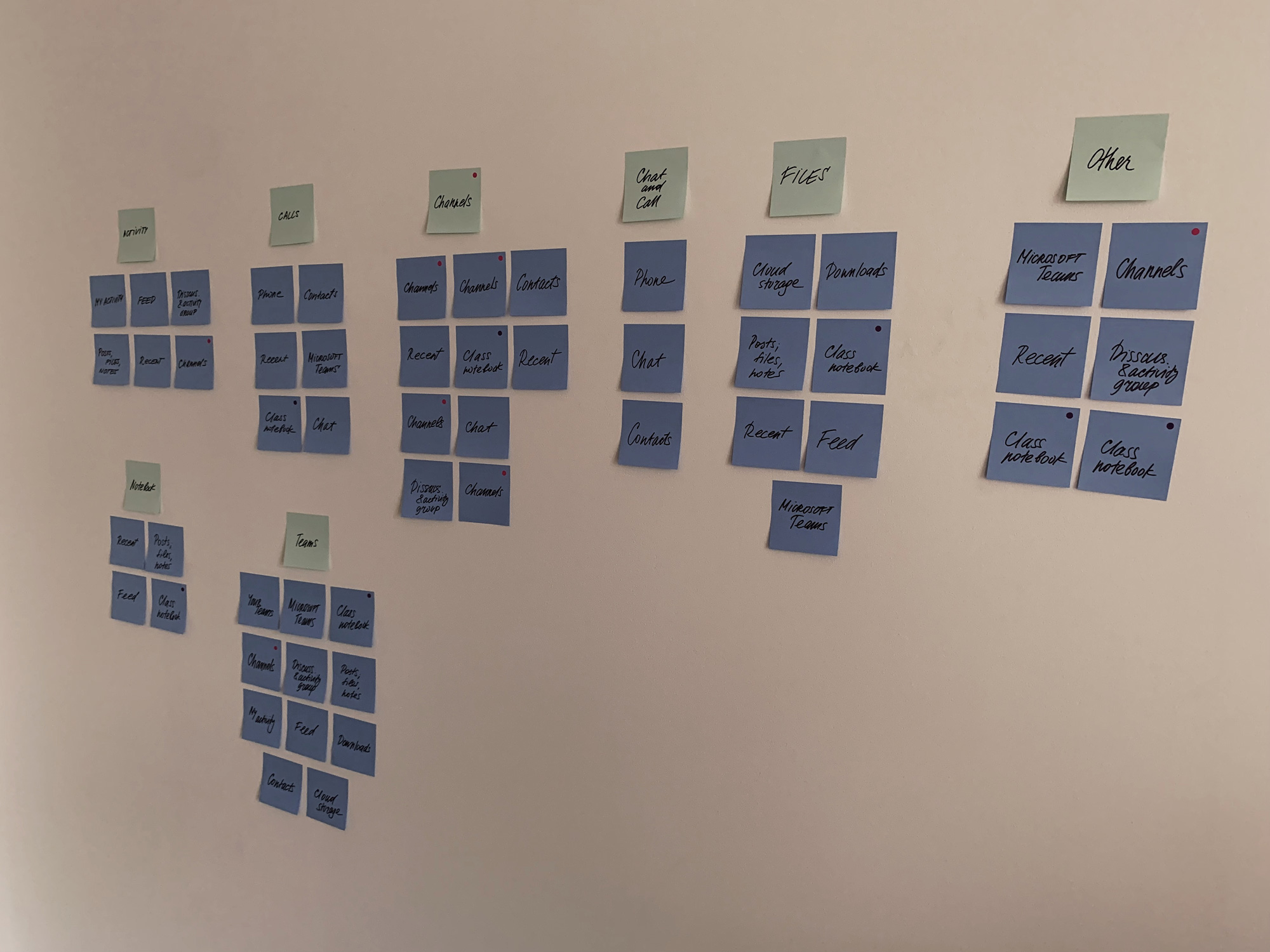
Card sorting workshop - round 1
CARD SORTING 2
New categories were introduced:
Classes
Contacts
Downloads
New categories were introduced:
Classes
Contacts
Downloads
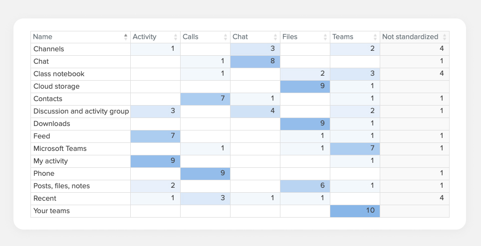
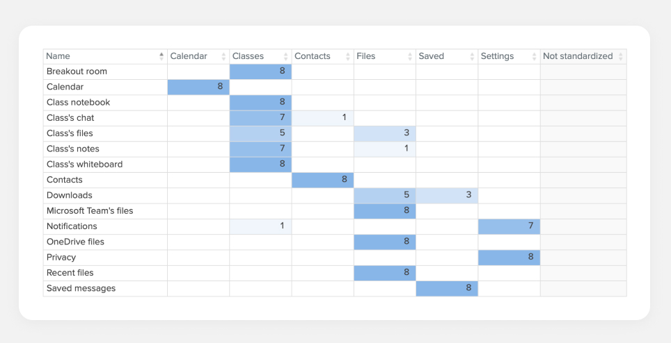
After analyzing the insights from the first round of card sorting I created six main categories and conducted a hybrid card sorting testing with 8 students who haven't participated in the first round.
![]()
Card sorting workshop - round 2
Defining information architecture
Based on the testing results, pages were organized into groups that are easier to navigate and make sense to students.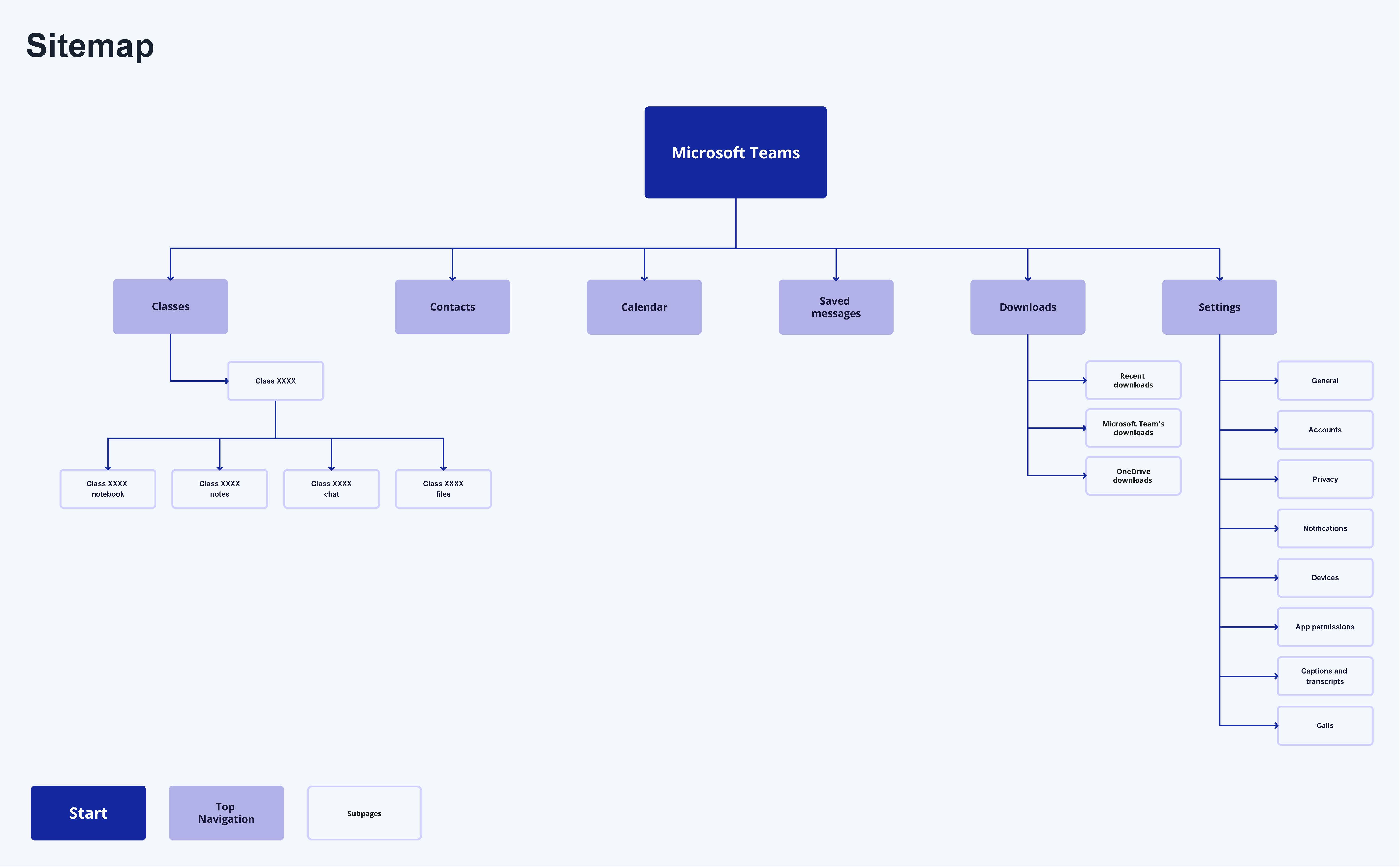
Updated information architecture
TREE TESTING UPDATED IA
New nav:
Classes
Contacts
Calendar
Saved messages
Downloads
All participants completed both tasks with a direct success.
New nav:
Classes
Contacts
Calendar
Saved messages
Downloads
All participants completed both tasks with a direct success.
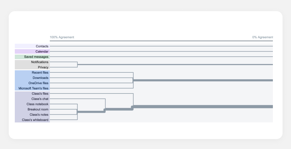
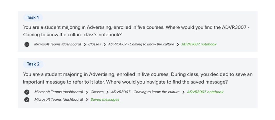
To see how the new IA performs I conducted an online tree testing with 9 students, w
![]()
Tree testing
Angela's user flowThese are the steps that Angela would take to successfully accomplish her tasks of attending a class and saving a message from a chat.
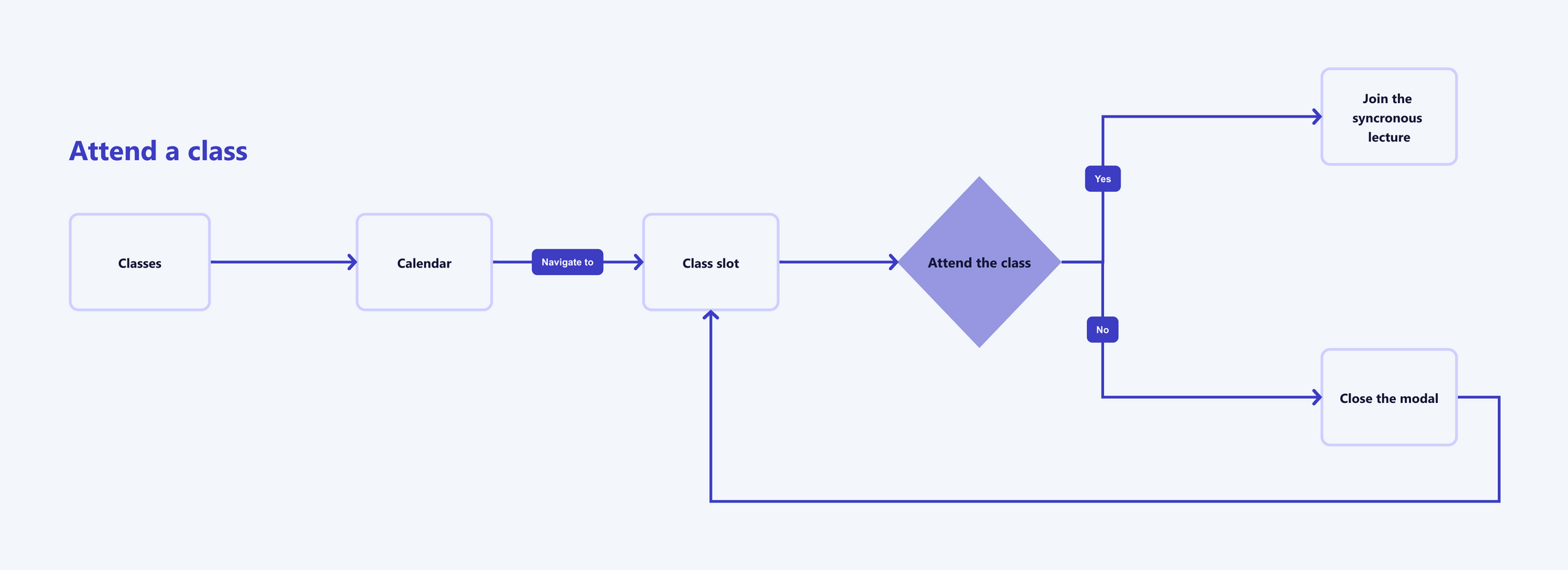
Attending a class
![Saving a message]() Saving a message
Saving a message
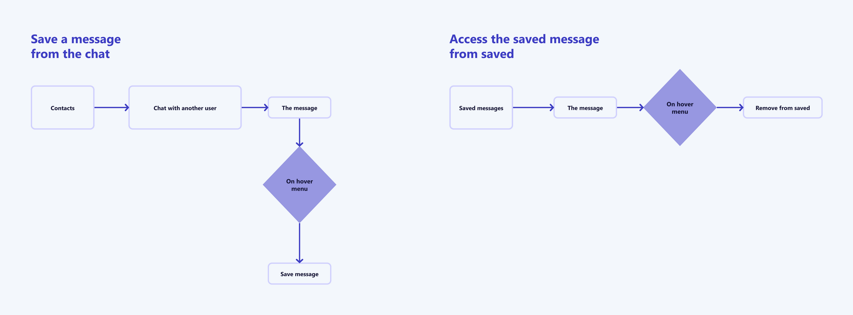 Saving a message
TESTING AND ITERATING
The testing was performed with 10 participants, who have not participated in card sorting or tree sorting earlier; I ended up with the following key takeaways:
100% of the participants successfully completed both tasks.
13% of misclicks were registered in the task 1.
49% of misclicks were registered in the task 2.
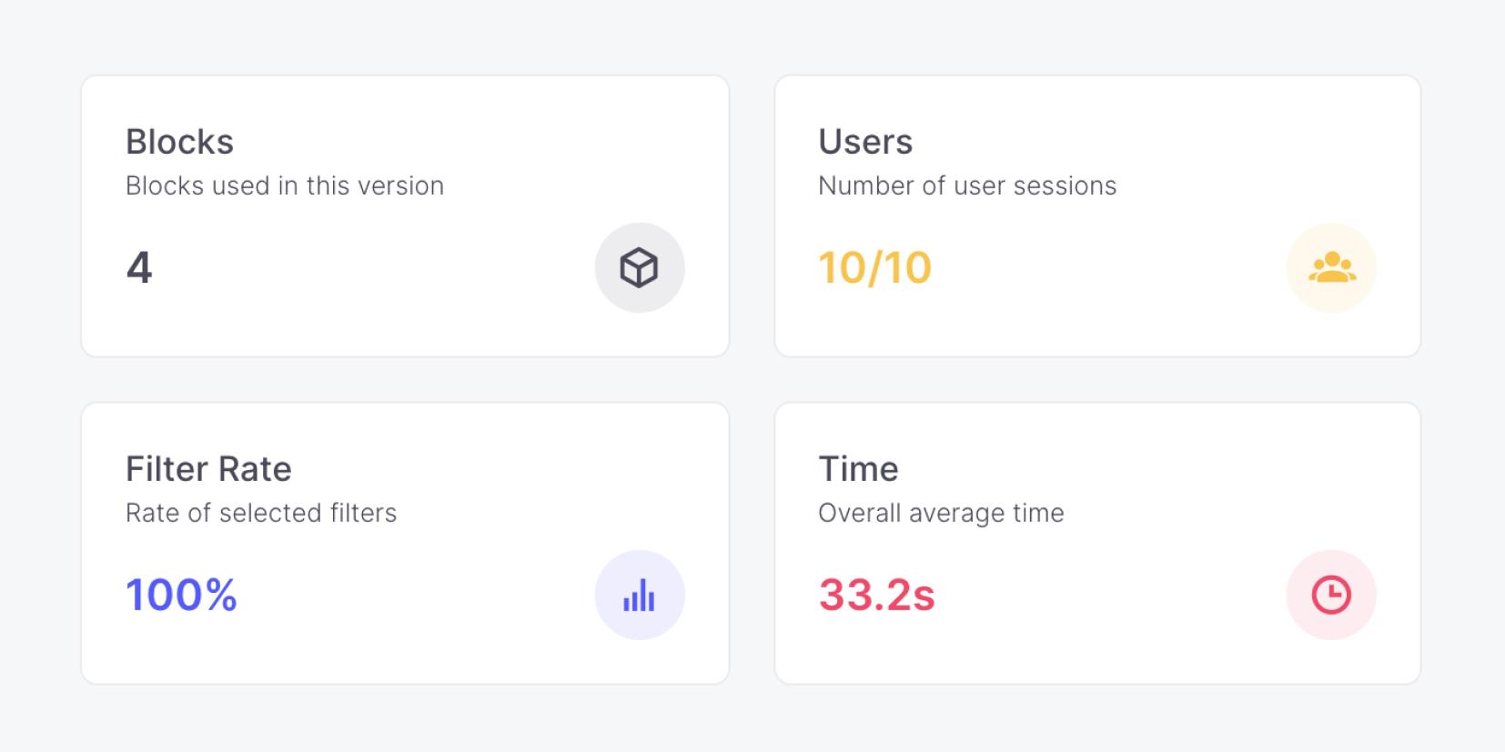
Usability testing - summary
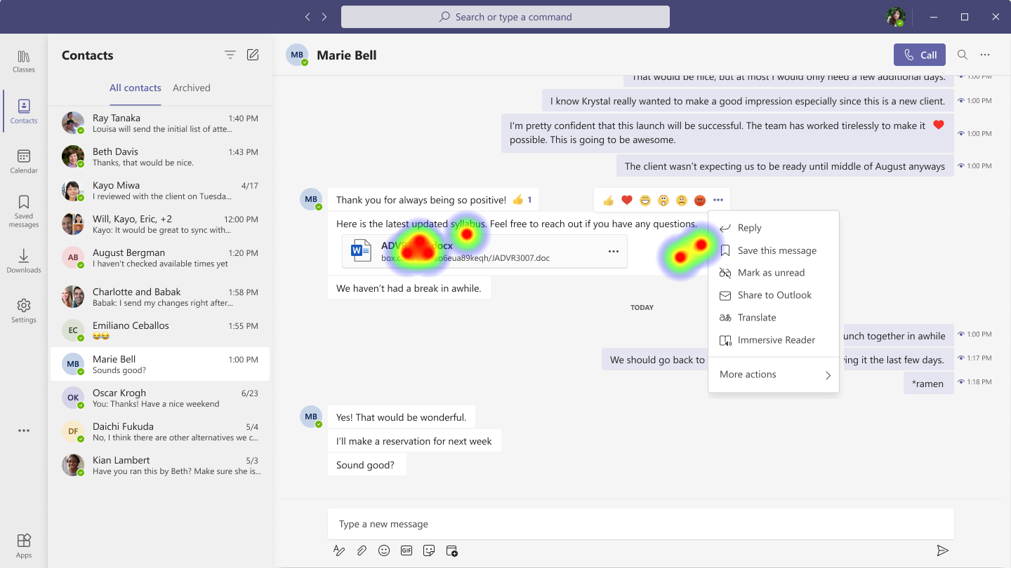
Usability testing - heatmap
Design outcomes
With all the data gathered and analyzed above and personas in mind I designed the high-fidelity outcome.OUTCOMES
- Updated labelling with user testing results.
- New improved navigation and simplified IA.
- High-fidelity prototype supported by user testing results.
Below are the final visual outcomes. I refer to the changes as Student edition screens; and the screens before changes as Originals.
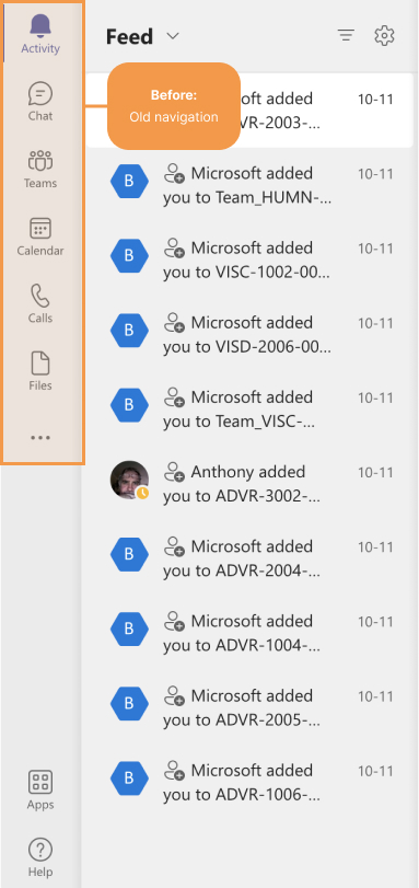
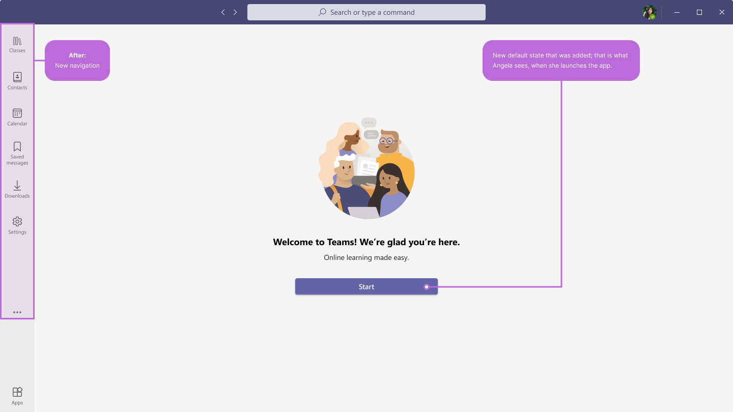
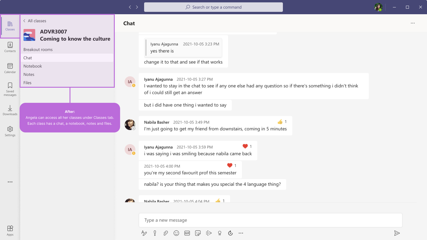
Screens below demonstrate the changes in the main navigation. The visual on the right is the new default state that was added; that is what Angela sees, when she launches the app.
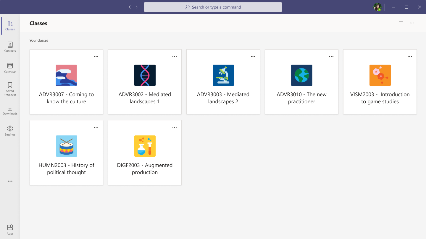
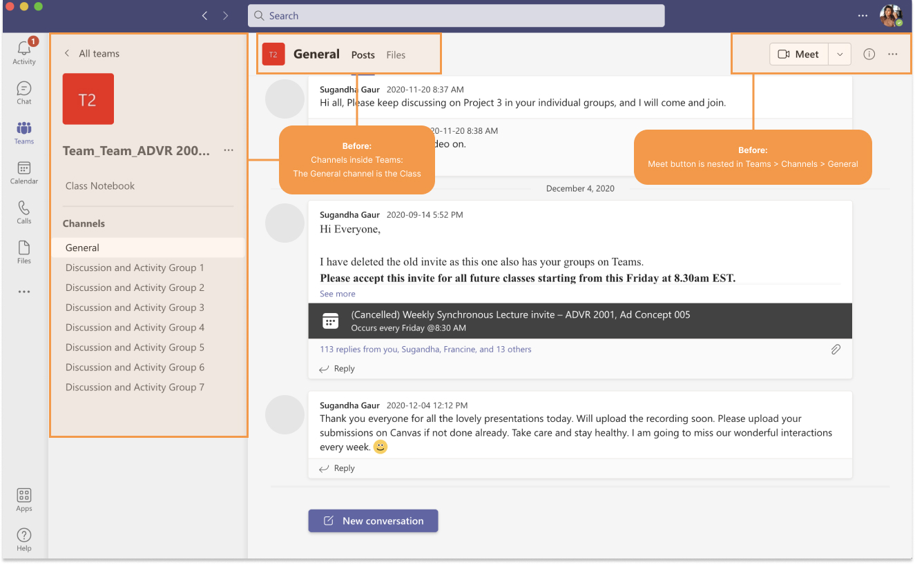
The class screens went a number of changes and student edition screen is structured significantly different from the original. The updated class screen has new labelling and navigation.
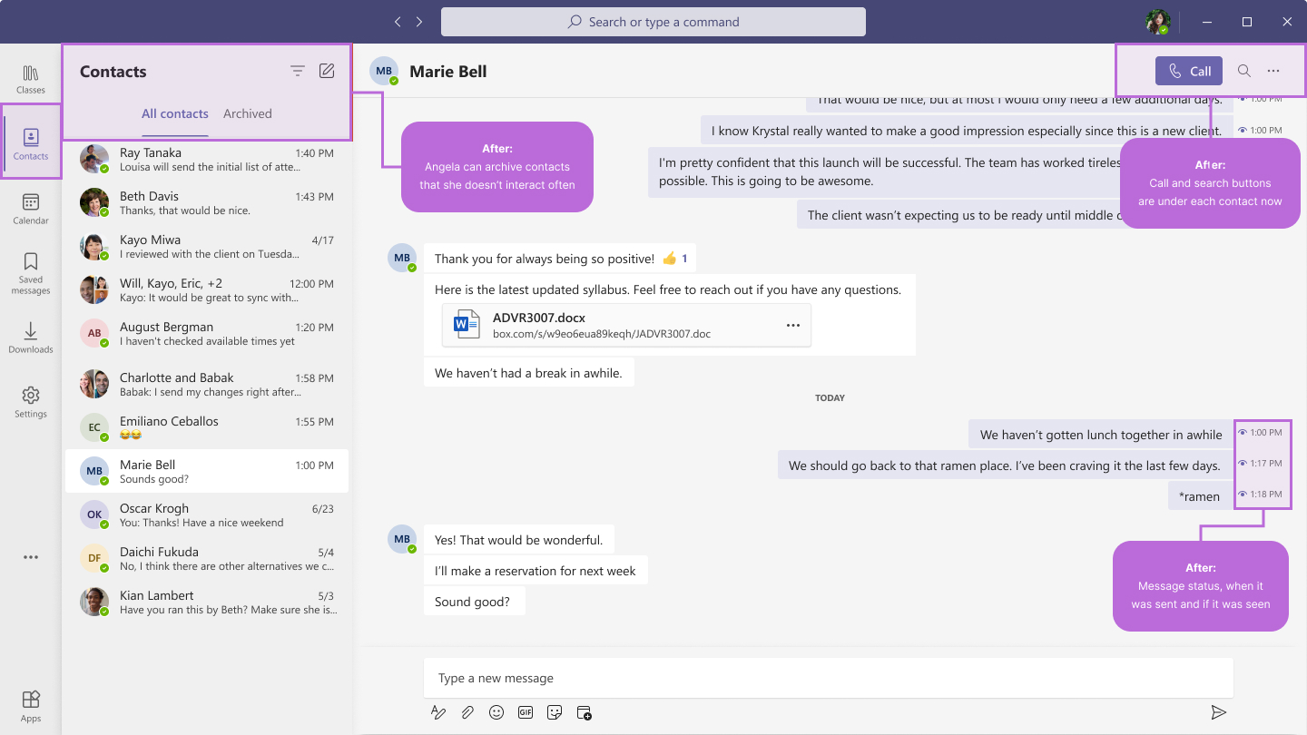
The calls screen is the one that got changed completely. According to the research and utilizing the key findings I designed a screen for contacts. In order to chat/call a person Angela needs to start with a contact that she is planning to interact with. She also has an option to archive chats she doesn't interact with often. Moreover, from the top right corner Angela can search within the chat or initiate video/audio call. All messages have a status indicator and time of delivery.
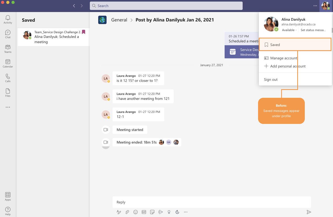
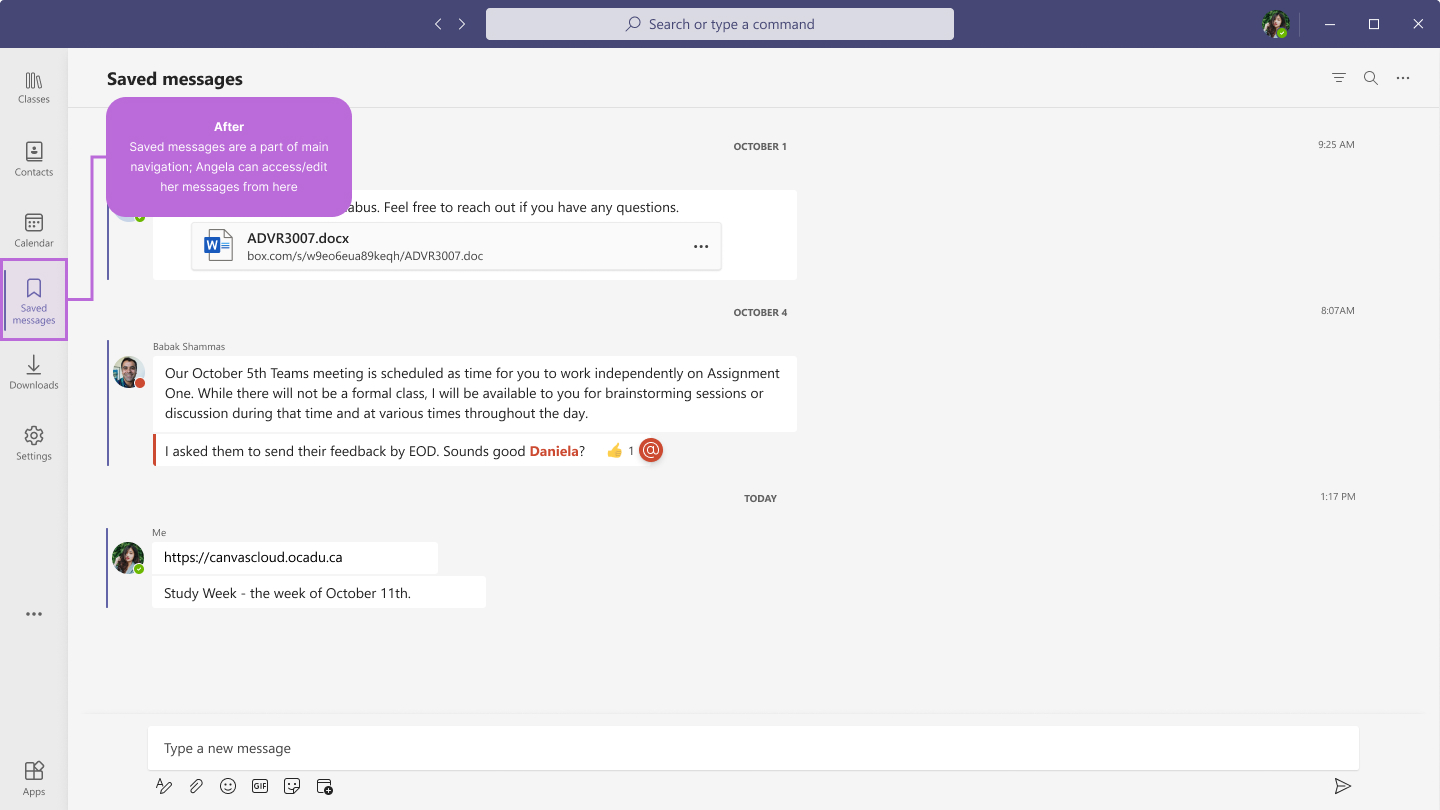
Saved messages is a feature that Microsoft introduced recently. According to the user interviews all participants were not aware of the new feature. In the original flow - in order to get to the saved messages, Angela has to navigate to her profile - options menu - saved. Referring back to the findings, saved messages is a desirable feature that I made a part of the main nav. Angela can see the sender information, date and time of each message.
An updated calendar has blocks for each class; each slot has two CTAs: edit invite or attend class. Angela can only join the class from the calendar during the specified time. She can also schedule a new meeting from the top right corner. Students can only join the class after the host started the class.
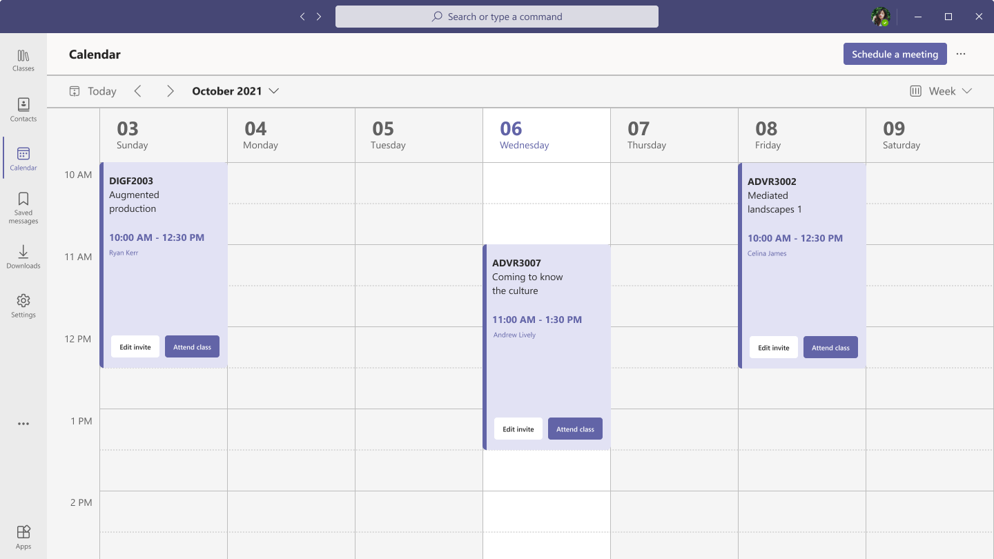
Student edition - calendar
NEXT STEPS
- Perform another round of usability testing with new participants.
- Perform A/B testing for some screens.
- Provide more detailed screens for each class.